The global cosmetics industry “is expected to reach approximately USD 863 billion in 2024
02
European brands, such as LaMer, are now competing with asian K-Beauty and J-Beauty brands.
03
Provenance and perceived value have traditionally been linked to price.
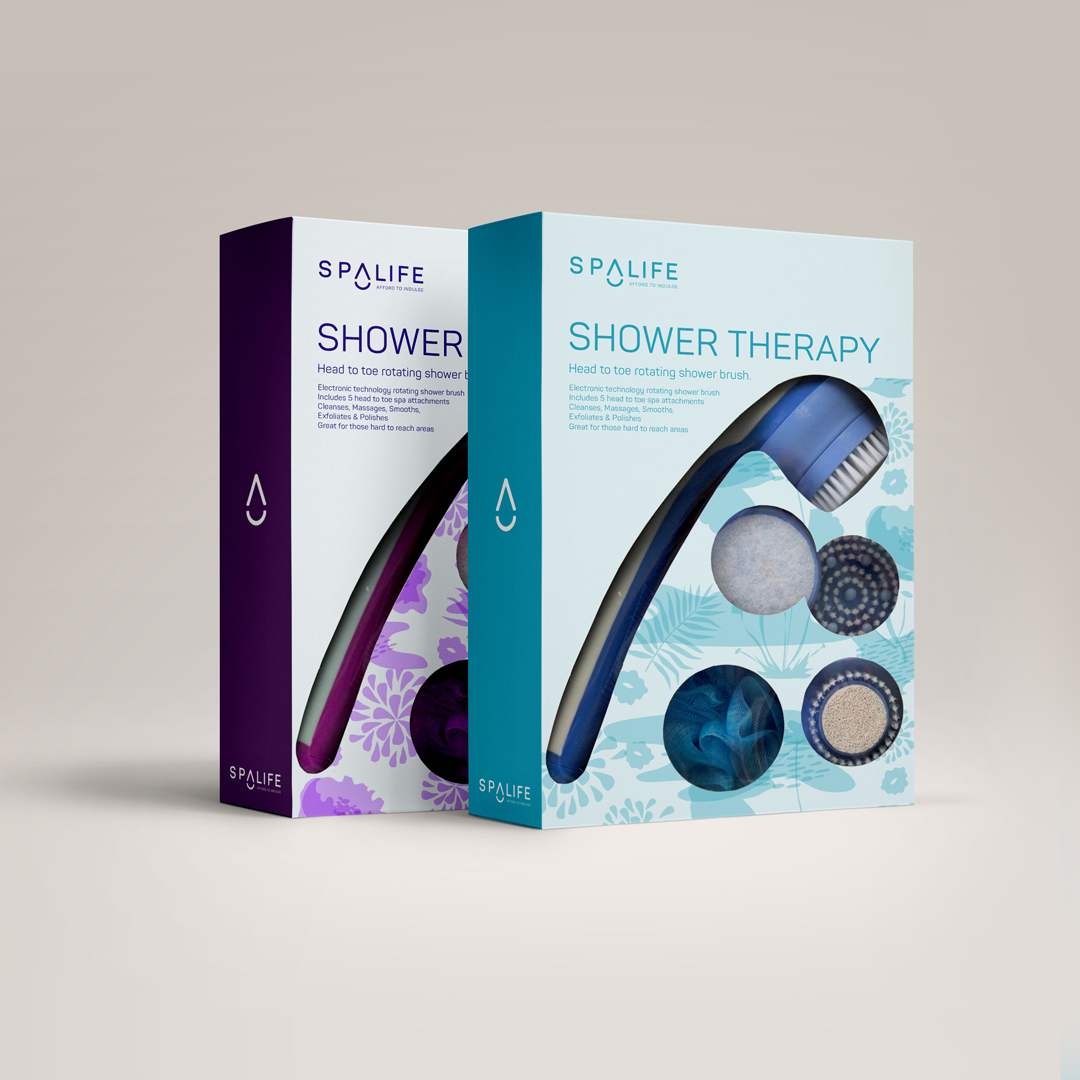
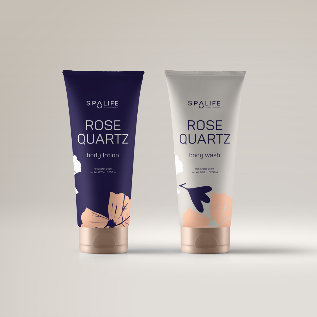
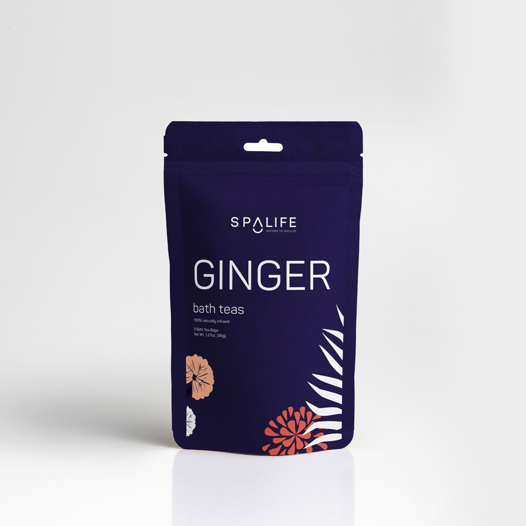
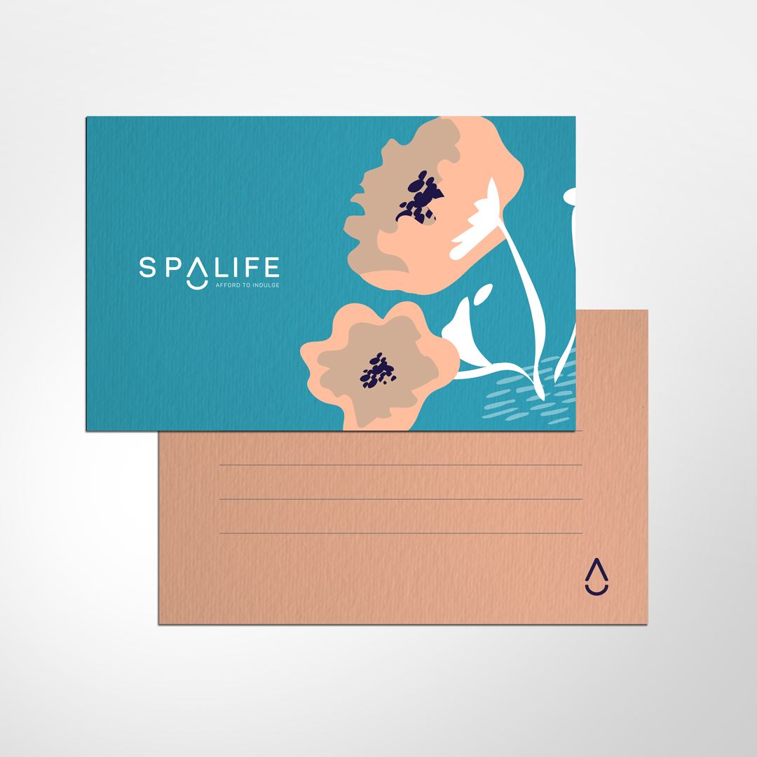
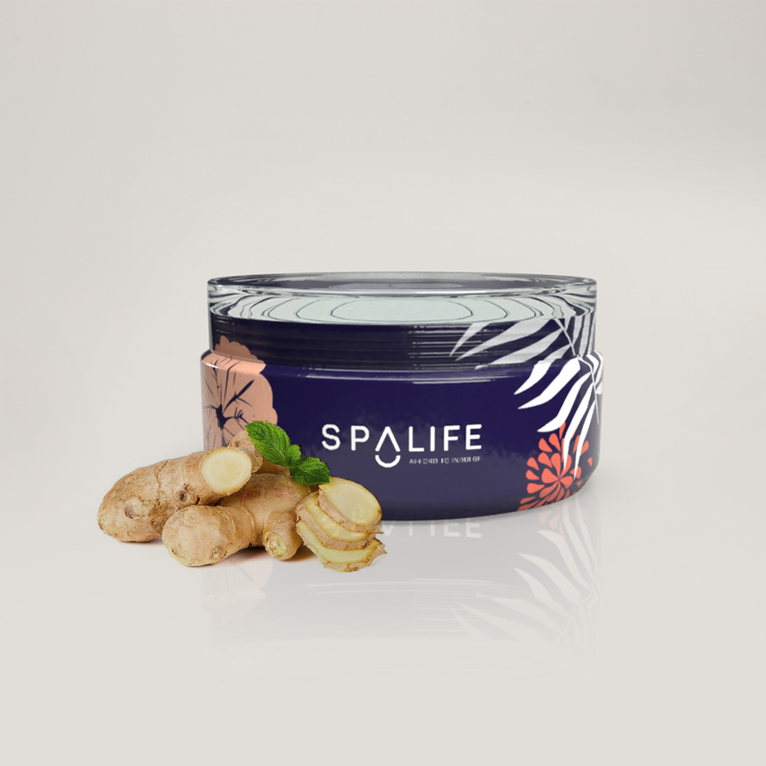
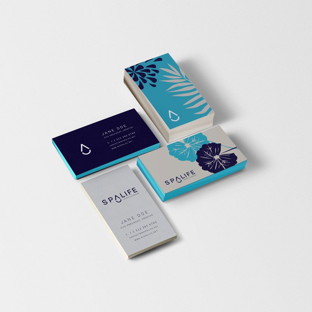
The final logotype pairs a clean simple typeface with an abstracted letterform that doubles as an iconic drop. The sans-serif typeface Panton® was selected because it is upscale yet approachable. The Drop icon can be used to communicate the brand at smaller sizes and in unique applications.
MIDNIGHT
SEA
Blush
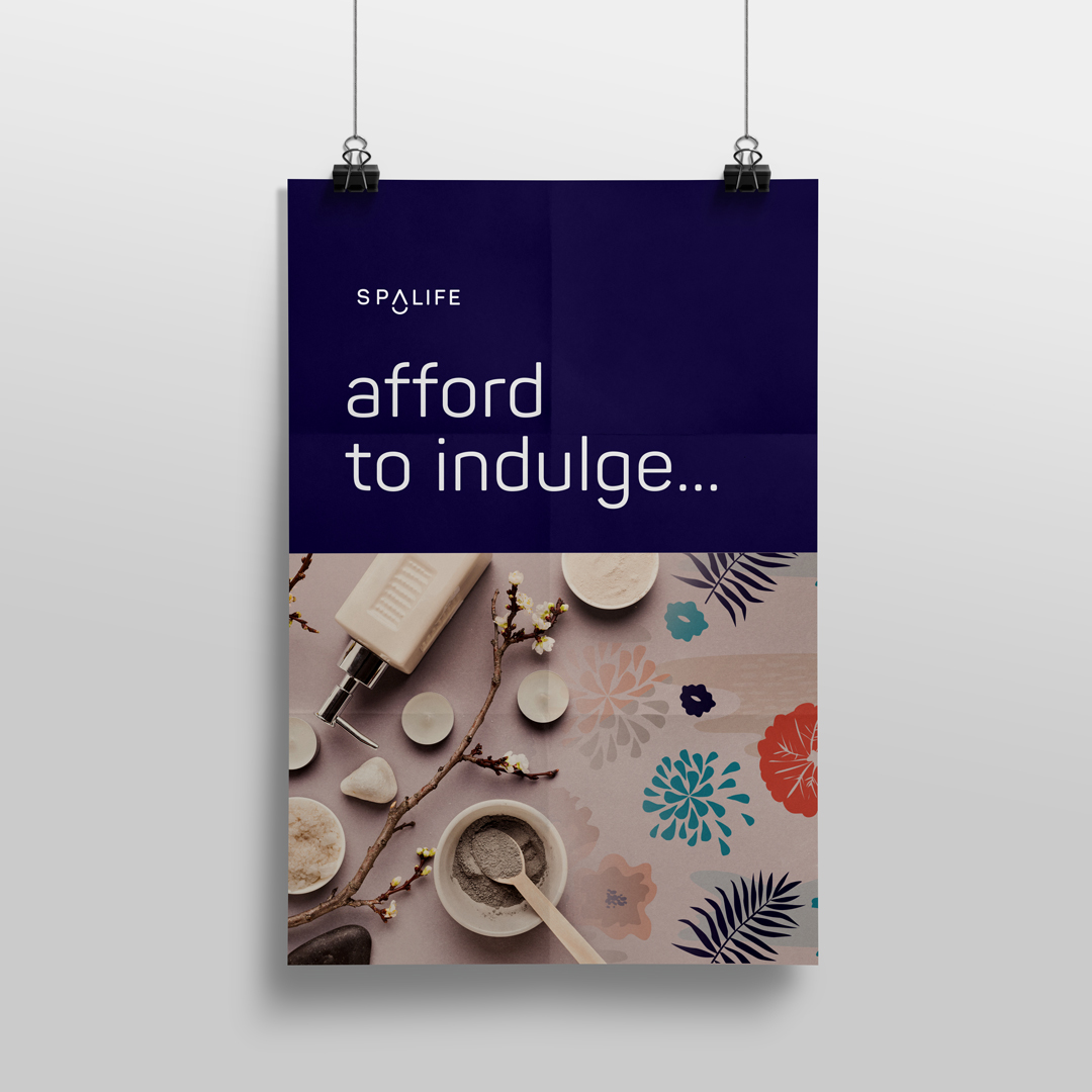
Afford to indulge…
Skincare you can afford to indulge.
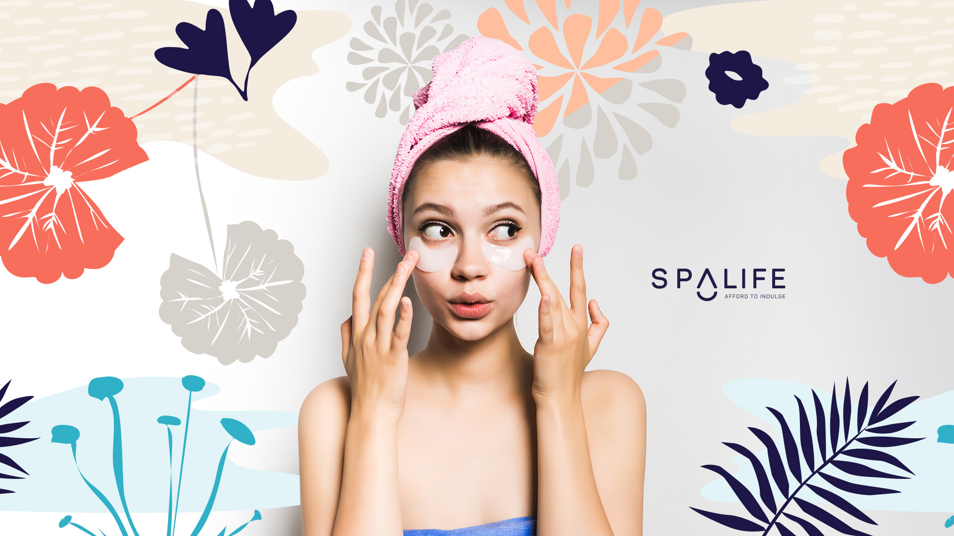
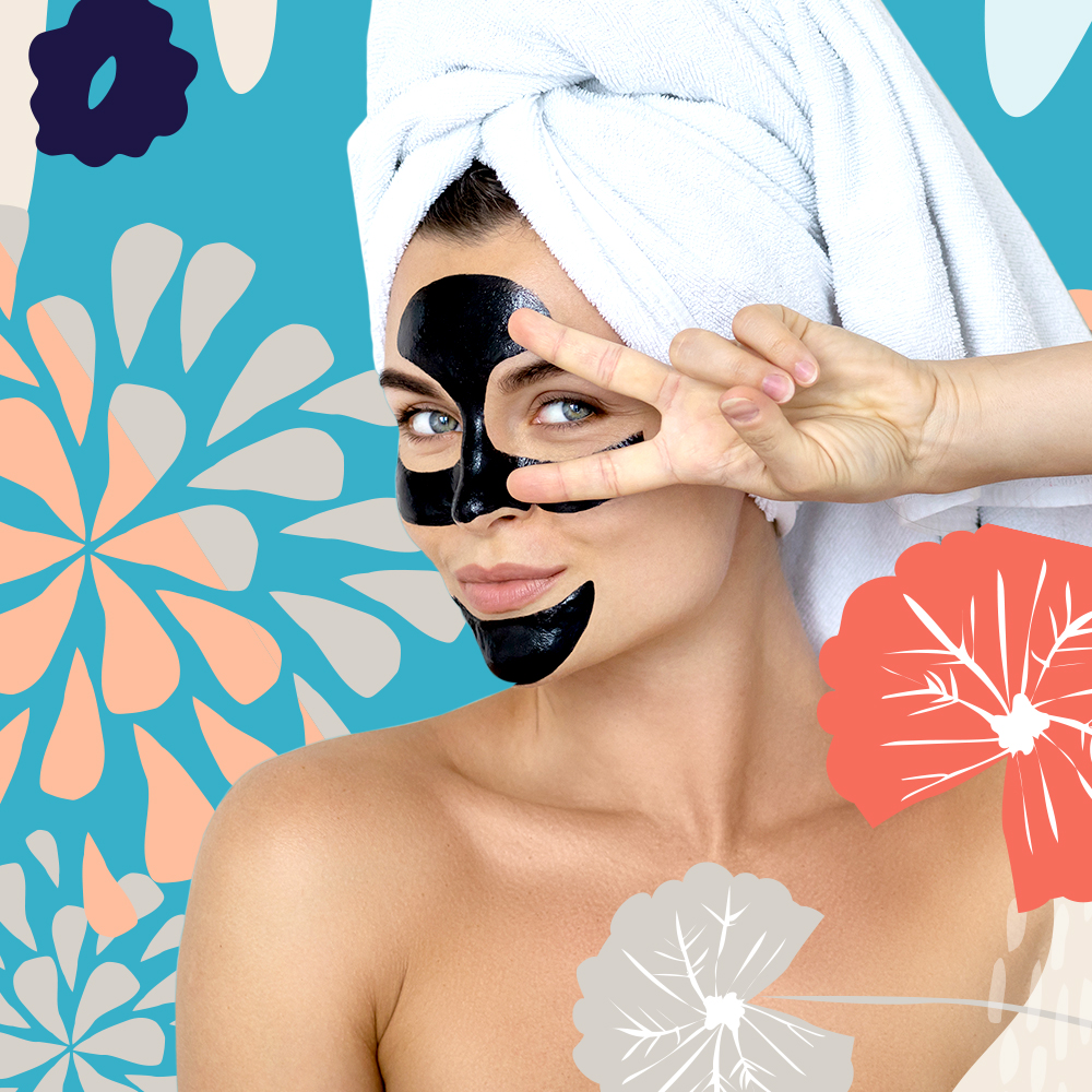
SpaLife is a down-to-earth, cheerful, and charming brand with an approachable and elegant character. These traits influence it’s products, service, and integrated experiences across all customer touch points.
Brand mission: To create and encourage moments of you.
Brand essence: Indulgence — Experience — Joy